Statistical plots are different from conventional 2D-plots since they are not use to show the data themselves. Instead, they are able to present the results of some statistical analysis of the data. Following this, histogram are completely different from the plots obtained by the Vertical Bars command.
Box plots are used to show some statistical values which are significant parameters of the distribution of the data. Let's assume that we have a table with 12 values in a column. If you select this column and build a box plot with the Statistical graphs→Box Plot command, you will obtain a graph which is close to the one presented in the figure 2.24. By default, the values which are computed from your data are (figure 2.24):
Ymax The maximum value of Y
Y5% The value of Y corresponding to the top 5% of the distribution of numbers
Y25% The value of Y corresponding to the top 25% of the distribution of numbers
Y50% The value of Y corresponding to the top 50% of the distribution of numbers (also known as the median value)
Ymean The average value of Y
Y75% The value of Y corresponding to the top 75% of the distribution of numbers
Y95% The value of Y corresponding to the top 95% of the distribution of numbers
Ymin The minimum value of Y
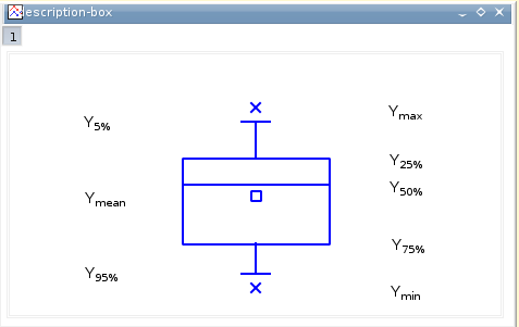
All these parameters give informations on the distribution of data in the column. For example, the difference between Ymean and Y50% is an indication of the symetry of the distribution. Statistical parameters can be used also to compare distribution of data, you just have to select all the columns and build the box plot.
There are two ways to modify a box plot: you can modify the statistical parameters which are shown. As in all other plots, you can also modify the appearance of the graphic items.
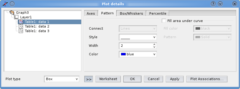
This tab is used to modify the aspect of the box and of the upper and lower whiskers which are attached to it. You can also remove the box and/or the whiskers.
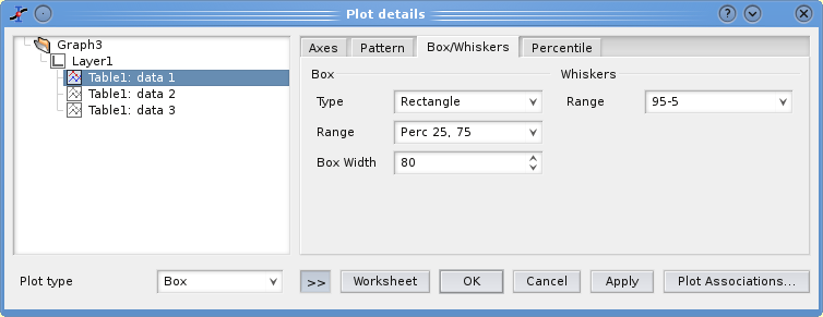
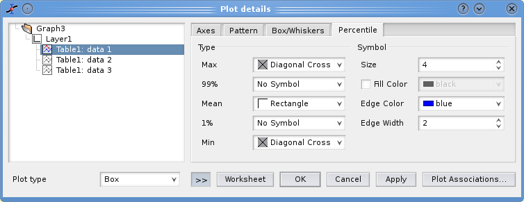
As explained above, the default is to draw 3 symbols corresponding to Ymin, Ymean and Ymax. These symbols can be modified (or removed) here. Moreover, you can add two other symbols corresponding to Y99% and Y1%.
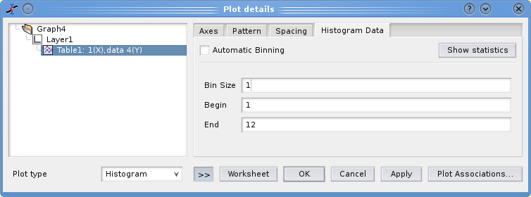
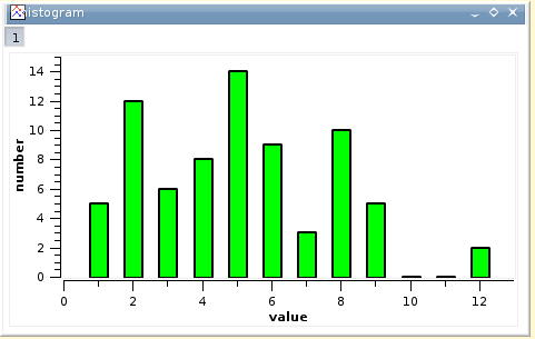
An histogram can be used to show the distribution of the values, that is the numbers of values which are in given intervals. Let's assume that you have a set of data in a column. You can select this column and use the Statistical graphs→Histogram command. After some customization (see next section), you can obtain a plot like the one presented in the figure 2.28.
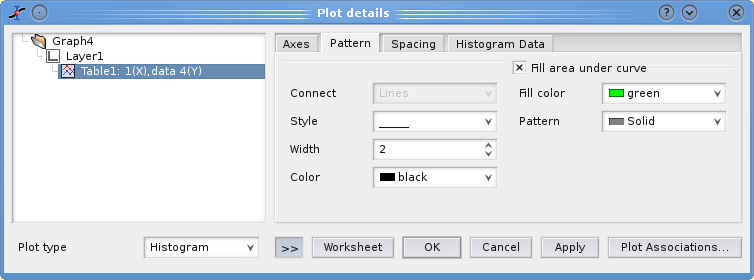
As for other plots, you can access to the dialog plot through the Plot command of the Format menu. You can also use the other commands of the Format menu to modify axes, labels, titles, etc. The first tab can used to modify the appearance of the columns: lines and filling.
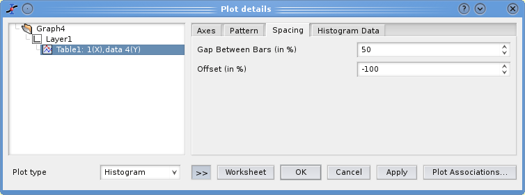
The second tab allows to modify the geometrical parameters of the columns. The parameter gap between bars define the distance between two adjascent columns. This is not a true distance, it define the fraction of space which is occupied by the intervalles between columns. By default, this parameter is at 0% so that there is no space between columns. In the example of figure 2.28, a value of 50% has been used, so that the width of space and columns are equal.
the second parameter Offset can be used to shift the bars from their default position. For example, In the figure 2.28, the number of values between 3 and 4 is 6, and the corresponding column should be plotted at an abscissae of 3.5. In order to have this column corresponding to the value X=3, a negative shift has been applied. The value of the shift is a percentage of the width of the column, the maximum width of the columns is ΔX=1 in this example and a a gap of 50% is used so a value of -100% has been used, corresponding to a shift ΔX=-0.5.
The last tab is used to define the number of columns used for the plot. It is defined by the X range used for the statistical analysis, and the size of each interval. The default is to use 10 interval in the range [Ymin:Ymax].