Table of Contents
A 2D plot is based on curves which are defined by Y values as functions of X values. There are different ways to obtain a 2D plot depending on the way the (X,Y) values are defined:
You can have your (X,Y) values in a table. You need to select at least one column as X values and one column as Y values. This is specified with the Set Column as command. Then you can select the columns and use one command of the Plot menu to plot the data.
If you want to plot a function, you don't need a table. You can use directly the New→New Function Plot command. This will open the corresponding dialog box and you will be able to define the mathematical expression of your function. In this case, plot can be obtained from functions in cartesian coordinates Y(X), but also in parametered coordinates (X(t),Y(t)), or in angular coordinates r(theta);.
The combined way is to define a table, and then to fill in the table with the results of functions. This can be done with the Assign Formula command. Then you can select the columns and use one command of the Plot menu to plot the data.
SciDAVis will create a new graph window, and the plot will be inserted in a new layer.
Once the plot is created, you can customize all the graphic items of the plot with the commands of the Format Menu. You can add new items (text labels, lines or arrows, new legend, images) on the plot with the commands of the Graph Menu.
The data must be stored in a table. There are several possibilities to insert your (X,Y) values in the table: you can write them directly from the keyboard, or read them from a file. Here we will use the first solution, refer to the Import Ascii command to use the second one.
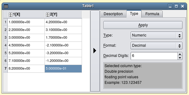
The first step is to create an empty project with the New→New Project command from the File menu, you can also use the key CTRL+N or the ![]() icon from the File toolbar. Then create a new table with the New→New Table command from the File menu or with the CTRL+T or with the
icon from the File toolbar. Then create a new table with the New→New Table command from the File menu or with the CTRL+T or with the ![]() icon from the File toolbar.
icon from the File toolbar.
At its creation, the table has two column (one for X and one for Y) and 32 rows. You can add rows and columns by selecting a row or a column and using the right button of the mouse, you can also modify the number of rows and columns with the Dimensions command from the Table menu. Then, enter your values, and you obtain the table shown in figure 2.1
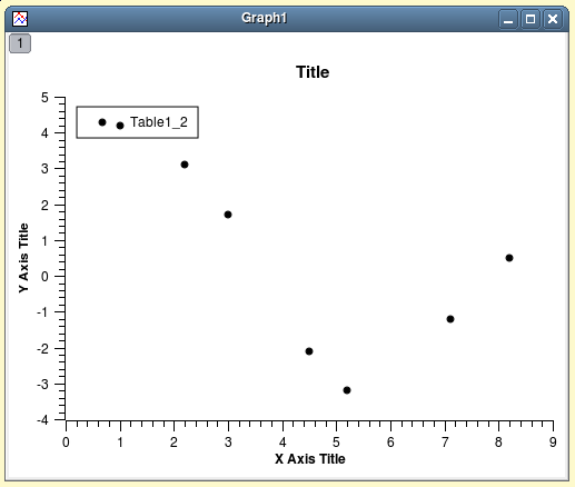
Then, you have to select the two columns, and build your plot (here a simple 2D scatter) with the Scatter command from the context menu, or by clicking on the corresponding ![]() icon from the Plot toolbar or with the Scatter command from the Plot menu. A plot is created which uses the default options for all elements. You can customize these default options with the 2D plot preferences dialog. With the default options, you obtain the plot shown in figure 2.2.
icon from the Plot toolbar or with the Scatter command from the Plot menu. A plot is created which uses the default options for all elements. You can customize these default options with the 2D plot preferences dialog. With the default options, you obtain the plot shown in figure 2.2.
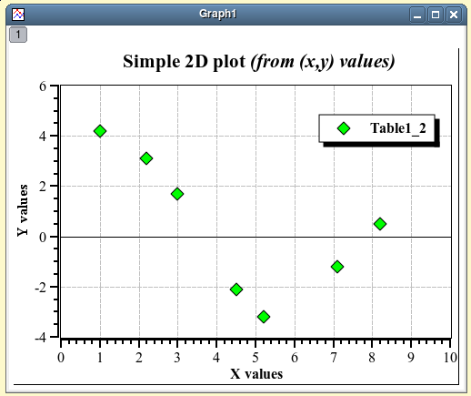
You can now customize your plot with the commands of the Format menu. By double clicking on the data points, you open the Plot command dialog which is used to modify the symbols. Then a double-click on the axes opens the Axes command dialog, and you can change the scales, the fonts for the axes labels, etc. You can also add grid lines on X or Y axes (Grid command), etc. Finally, a double click on each text item (X title, Y title, plot title) allows to change the text and the presentation of these elements. See the customize section for more details. An example of the final plot is shown in figure 2.3.
Finally, you have to save your project in a '.sciprj' file with the Save Project command from the File menu or with the CTRL+S or with the ![]() icon from the File toolbar. Depending on your application, you can export your plot to a standard image file with the command Export Graph→Current command from the File menu (or with the ALT+G keycode).
icon from the File toolbar. Depending on your application, you can export your plot to a standard image file with the command Export Graph→Current command from the File menu (or with the ALT+G keycode).
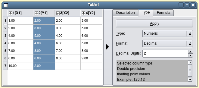
There are several types of plots which can be built from a table. They are presented in the Plot menu. One important feature is that it is possible to use up to four axis for the data. For example, create a new table, modify its dimension to 4 columns and 7 rows. Then select the third column and set it as X with the Set Column as command from the Table menu; you can then enter the values of two series (X1,Y1) and (X2,Y2) as show in the figure 2.4.
To build the plot, select the two Y column (select Y1, and the select Y2 with CTRL key), use the Plot menu. You obtain a simple plot with two axes, then use the Plot command. In the left window, select the data serie for which you want to change the axes, click on the axis tag and define the axes you want to use. After this, the plot is modified but the new axes are not shown. Use the Axes command, select the new axes and click on the show checkbox. You can then customize your plot in order to obtain the result presented in figure 2.5.
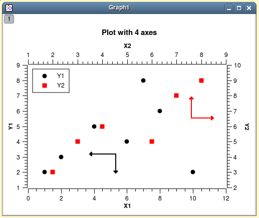
In addition to the customization which has been already described, four arrows were added with the Draw Arrow command.
There are two ways to obtain such a plot: you can plot directly a function or fill a table with the values calculated from this function before doing a plot in the classical way.
If you just want to plot a function, you can use the New→New Function Plot command from the File menu or with the CTRL+F or with the ![]() icon from the File toolbar.
icon from the File toolbar.
You can then enter the expression of your mathematical function, the X range used for the plot, and the number of points used in this X range. See the Add Function command for details.
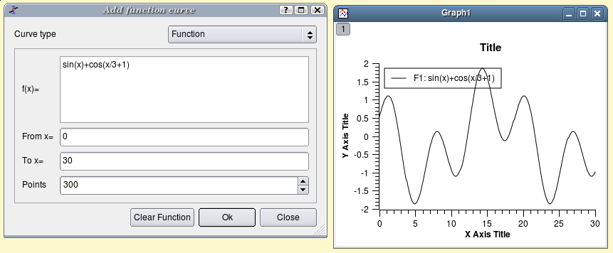
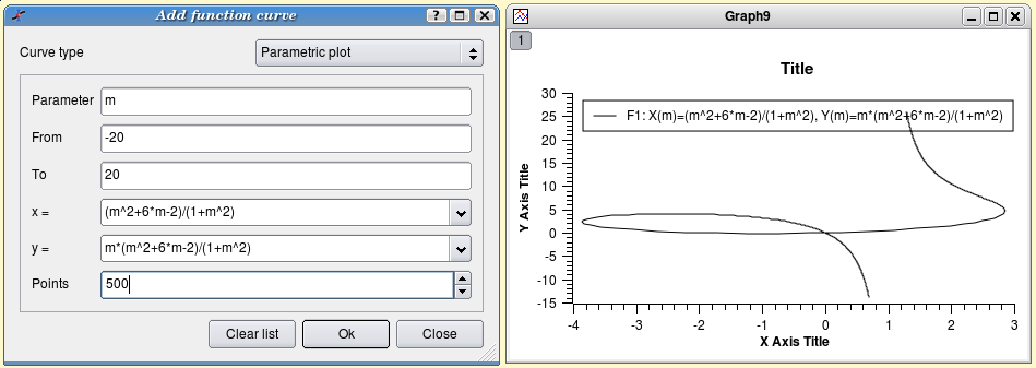
The generic plot which is created by this command can then be customized as explained in the previous section. Beside classical Y=f(X) functions, parametric functions and polar functions can be defined. In parametric coordinates, X and Y are defined as functions of an independant parameter m. You can define these functions, the range for m and the number of points computed in this range.
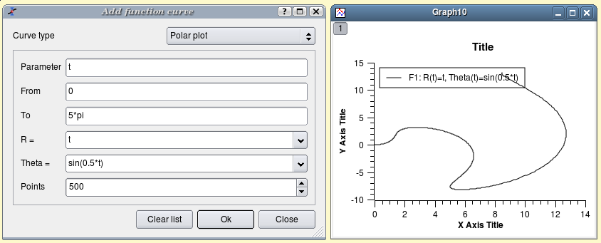
Polar coordinate are defined as a radius R and an angle theta (in radian). The coordinates are then obtained by X=R.cos(theta) and Y=R.sin(theta). You can use a parametric definition: R=f(t) and theta=f(t), the range for t and the number of points computed in this range.
If you just want to work not only with the plot but also with the data, you can create a new table as explained in the previous section. Then you can fill this table with the values of a function with the Assign Formula command. The main advantage of this method is that you can do further analysis of the calculated data as the are kept in a table.
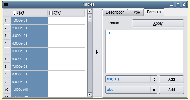
To obtain the same plot as in the previous example, you need to create a new table (key CTRL+T) and use the Dimensions command to define 300 rows, then select the first column and use the command Assign Formula command from the context menu, or from the Table menu. The row number symbol is i, so you can enter the function expression i/10 (figure 2.9).
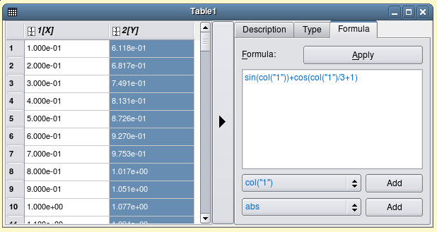
The second step is to select the second column and use the same command. The expression is a function of the X values, that is the first column named col(1) (figure 2.10).
Once the table is ready, you just have to build the plot as explained in the previous section.
Beside the conventional X-Y plots with lines and points, other kinds of plots are available in SciDAVis. Although the presentation of the data can be very different, they are all based on the use of one column for X values and one column for Y values. Follow the links to the corresponding commands to see a description of these plots.
The first set is available in the subset Special Lines/Symbol of the Plot menu:
Drop lines plot (Special Line/Symbol→Vertical Drop Lines command)
Scatter plot with a smoothed line connection between the points (Special Line/Symbol→Splines command)
Vertical steps plot (Special Line/Symbol→Vertical Steps command)
Horizontal steps plot (Special Line/Symbol→Horizontal Steps command)
The other ones are more special plots which can be accessed directly in the Plot menu:
Vertical bars plot (Vertical Bars command)
Horizontal bars plot (Horizontal Bars command)
Area plot (Area command)
There are many way to improve and modify the plots:
The first part of the commands are used to modify the main elements of the plot, that is axis, labels, etc. They can be accessed through the Format menu.
The second part of commands can be used to insert additional objects likes arrows, images, text labels, etc. They can be accessed in the Graph menu.
This section will show an overview of the first set of commands. See the Graph menu section for the other commands. There are three main windows which allows to modify the plot:
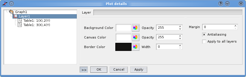
The Plot command, it is entitled "Plot details" and is used to customize the global properties of the plot (background color, etc) and the data series (points shape, line width, etc).
The second one is entitled "General plot options" and contain the commands to format axes (scales, labels, grids, etc), it can be accessed through the Scales command, Axes command and Grid command.
The last one is the Title command which is used to control the properties of the title of the plot.
All these commands are accessed through the Format menu.
This window has two parts, the left one shows a tree view of the main elements of the plot: the layers and the data series which are plotted in each layer. The main dialog is activated by selecting the Plot command from the Format menu. If it is activated by a double click on a curve in the plot, the same dialog will be opened with the corresponding curve selected (see next section for details). The right section of the window shows the options which are available for the selected entity. If you do some changes, don't forget to click on the Apply button before switching to another entity.
This dialog can be used to modify the background color of the global plot area (i.e. the layer), the color of the canvas (that is the area in which curves are plotted), and the border of the plot. This border is for the global plot, if you want to add a border to the canvas, you can use the general tag of the Axes command. If the image format use to save the plots support it, you can also control the transparency of these objects through the opacity parameter. The default value is 255 which means no transparency. See the Export Graph command for details on image formats.
The commands can be accessed by a double click on a curve, or by using the Plot command and selecting a curve in the window on the left. The right part of the dialog box contains several tabs which depend on the kind of plot that you are using. The left part of the dialog window shows the curves which are plotted in the active layer. All the modifications will be done on the selected curve.
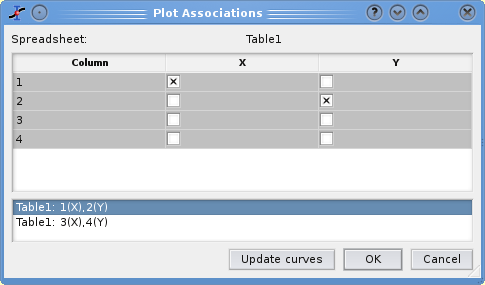
In this dialog box, beside the customization of data curves, you can change the columns which are used by clicking on the Plot Associations... button. This will open a dialog which can be used to select the columns of the table which are used as X and Y values.
The button Worksheet can be used to access to the table which contains the columns selected.
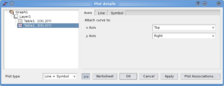
The dialog presented in figure 2.14 is activated for plots drawn with symbols, line+symbols, lines, vertical drop lines, steps and splines. The first tab labelled axis can be used to select the axis which are used for each curve of the plot: bottom (default) or top for abscissae, and left (default) or right for Y values. Beware that whatever your choice the right and top axis will not be drawn, you need to use the Axes command to obtain a plot in which these axis are shown.
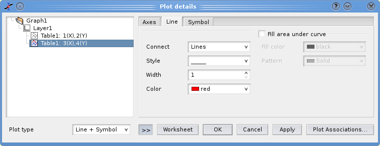
The second tab allows to modify the style of the line (color, line style, thickness). The connect button allows to change the style which is used to draw the selected curve (steps, droplines, etc). See the Plot menu to see examples of the different types of plot available.
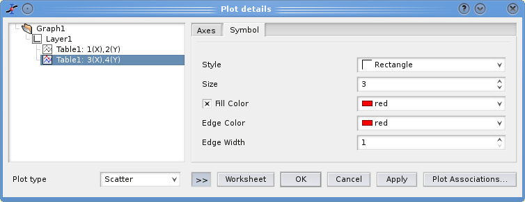
If you select a style with symbols (scatter or symbol+lines), a last tab can be activated to select the symbol, and to modify the size, the color and the filling color of the symbols.
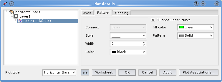
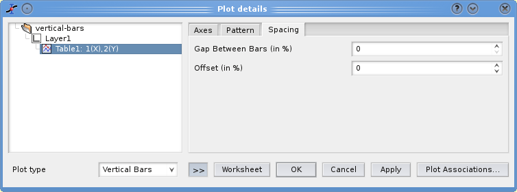
When the data are plotted using bars, the Plot details window shows different options. The first tab named Pattern can be used to customize the background and the border lines of the bars.
The second tab named Spacing can be used to modify the geometry of the bars:
The default width W of the bar is computed from the smallest difference between two successive abscissae, this correspond to a Gap between bars equal to 0 (which is the default value). All bar are drawn with the same width. The Gap is a percentage of this default width: that is, a value of 50 will decrease the width of all the bars by a factor 2.
The bars are placed in order to be centered around each X value, i.e. between x-W/2 and x+W/2; this correspond to an Offset of 0 (default value). The offset is again a percentage of the default width of the bar. For example, a value of 50 will shift the position of the bar by a half of the default width (W/2) and therefore each bar will placed between x and x+W. Negatives values can be used to shift the bars to the left. If inverted axes are used, the direction of the shift remains the same (i.e. positive offset lead to a shift to the right).
There are two ways to modify the default style which is used for plots. The first one applies to all plot and is reached by the Preferences command (in the Edit menu). And the second one is to define templates for a specific family of plots with the Save as Template command.
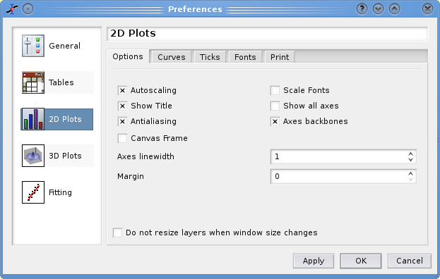
In the dialog box which is opened by the Preferences, the third set of options is used to customize the default aspect of 2D plots. The first tab is used to set some general options. Most of them are obvious to understand. If autoscaling is set, the scales of the axes will be reset to their default values each time a modification is done on the data series. The scale font option is set by default, in this case the size of the font are modified each time the window size is modified.
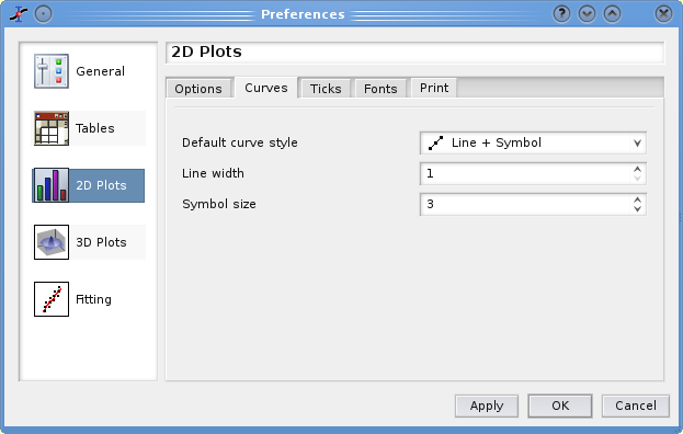
The second tab named Curves defines the default style used when you create a new plot.
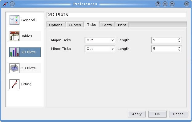
The third tab named Ticks defines the default style for the ticks of the axes used when you create a new plot.
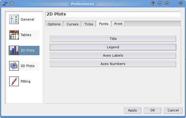
The fourth tab named Fonts defines the default style for the fonts used for the axes, used when you create a new plot.
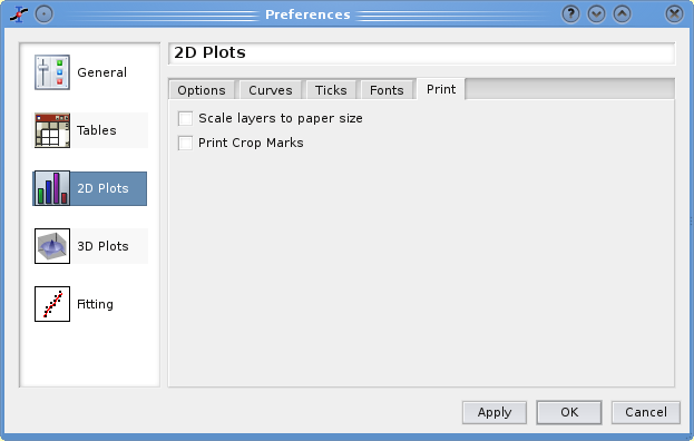
The last tab allows to modify two parameters for the printing of plots. The first one is used to re-scale the plot in order to fit the chosen paper size, the other one to print crops marks around the plot (for cutting).
If you want to build several plots based on the same model, you can use template files. This allows to save geometry of plots, the values, fonts and colors of labels, etc (see Open Template command for details on the items which are saved).
In the following example, the pristine figure is the simple 2D plot presented above, it was saved as a template and an empty plot was created by the Open Template.

You just have to add curves with the Add/Remove Curve command, but the style used to draw the curves is not kept in the template.