This menu is active only when a table is selected. It can also be accessed in the context menu when one or more columns of a table are selected. These commands allow to plot the data selected in the active table. There are several possibilities to plot from a table:
Conventional X-Y plots: lines, scatter
Other plots which are drawn as X-Y plots: columns, rows
Plots which need the computation of a distribution of values from the columns of data: histograms, box plots
Vector plots which need four columns
3D plots drawn from a set of (X,Y,Z) triplets in three columns
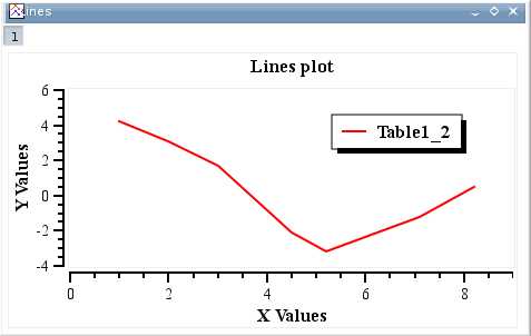
- Line
-
Plots the selected data columns in the active table window using the "Line" style. This command can also be activated by clinking on the
 icon of the Table toolbar. Once the plot is created, the drawing of the data series can be customized (see the section called “Customization of a 2D plot”).
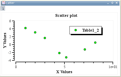
 - Scatter
-
Plots the selected data columns in the active table window using the "Scatter" style. This command can also be activated by clinking on the
 icon of the Table toolbar. Once the plot is created, the drawing of the data series can be customized (see the section called “Customization of a 2D plot”).
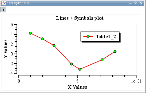
 - Line+Symbol
-
Plots the selected data columns in the active table window using the "Line + Symbol" style.This command can also be activated by clinking on the
 icon of the Table toolbar. Once the plot is created, the drawing of the data series can be customized (see the section called “Customization of a 2D plot”).
 - Special Line/Symbol →
-
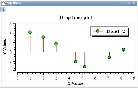
- Special Line/Symbol→Vertical Drop Lines
-
Plots the selected data columns in the active table window using the "Vertical drop lines" style. Once the plot is created, the drawing of the data series can be customized (see the section called “Customization of a 2D plot”).
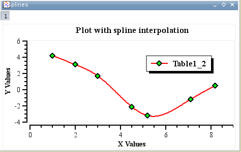
- Special Line/Symbol→Splines
-
Plots the selected data columns in the active table window using the "Spline" style. Once the plot is created, the drawing of the data series can be customized (see the section called “Customization of a 2D plot”).
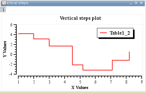
- Special Line/Symbol→Vertical Steps
-
Plots the selected data columns in the active table window using the "Vertical Steps" style. Once the plot is created, the drawing of the data series can be customized (see the section called “Customization of a 2D plot”).
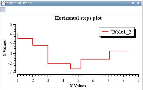
- Special Line/Symbol→Horizontal Steps
-
Plots the selected data columns in the active table window using the "Horizontal Steps" style. Once the plot is created, the drawing of the data series can be customized (see the section called “Customization of a 2D plot”).
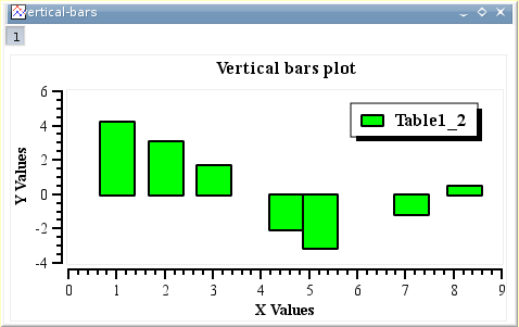
- Vertical Bars
-
Plots the selected data columns in the active table window using the "Columns" style, that is vertical bars.
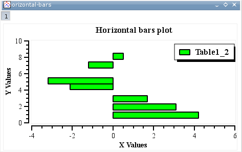
- Horizontal Bars
-
Plots the selected data columns in the active table window using the "Rows" style.
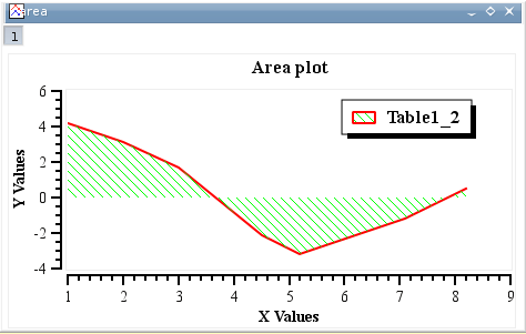
- Area
-
Plots the selected data columns in the active table window using the "Area" style, that is a line style with the area under the curve filled.
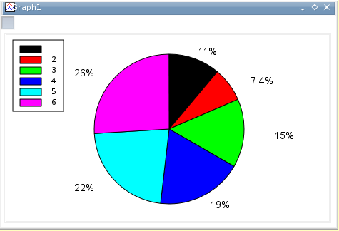
- Pie
-
Creates a 2D Pie plot of the selected column in the active table window (only one column allowed). See the section called “Pie plots” for more details.
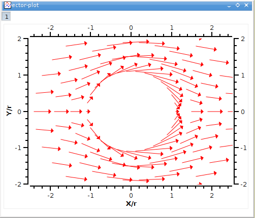
- Vectors XYXY
-
Creates a vectors plot of the selected column in the active table window. You must select four columns for this particular type of plot. The two first columns give the coordinates for the starting points of the vectors, the two last columns giving the information regarding the end points. See the section called “Vectors plots” for more details.
- Vectors XYAM
Creates a vectors plot of the selected column in the active table window. You must select four columns for this particular type of plot. The two first columns give the coordinates for the starting points of the vectors, the two last columns giving the angle (in radians) and the magnitude of the vectors. See the section called “Vectors plots” for more details.
- Statistical graphs
-
Statistical plot will not give a direct drawing of the data selected in the table, but they will give a representation of the frequency distribution of the Y-values.
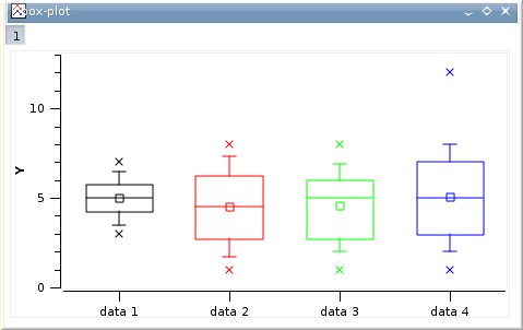
- Statistical graphs→Box Plot
-
Creates a box plot of the selected data columns in the active table window. This type of plot is used to give a graphical representation of the some classical parameters of the frequency distribution such as the mean of data, the min and max values, the position of the 95 and 5 percentiles, etc. The choice of the statistical parameters and the graphical parameters can be modified (see the section called “Box plots”).
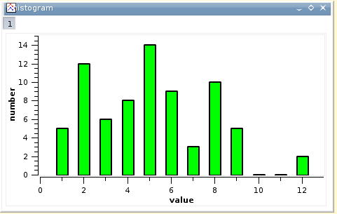
- Statistical graphs→Histogram
-
Creates a frequency histograms of the selected data columns in the active table window.
With this command, a frequency distribution is computed from your data. The default binning uses 10 steps between the max and the min of Y-values. The parameters used to compute the distribution and the graphical parameters used for the drawing of the columns can be modified (see the section called “Histograms” for details).
If you want to draw an histogram directly from values, use the 3D Plots→Bars command.
- Statistical graphs→Stacked Histogram
Creates vertically stacked layers displaying the histograms of the selected data columns in the active table window (one histogram per layer) See the Panel→Vertical 2 Layers command for more details.
- Panel
-
These commands can be used to obtain quickly some classical arrangements of multiple plot.
- Panel→Vertical 2 Layers
Creates 2 vertically stacked layers displaying the selected data columns in the active table window (one curve per layer).
- Panel→Horizontal 2 Layers
Creates 2 horizontally stacked layers displaying the selected data columns in the active table window (one curve per layer).
- Panel→4 Layers
Creates 4 layers on a 2x2 grid, displaying the selected data columns in the active table window (one curve per layer).
- Panel→Stacked Layers
Creates vertically stacked layers displaying the selected data columns in the active table window (one curve per layer).
- 3D Plots
-
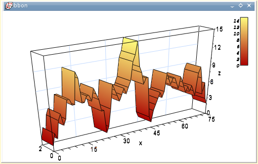
- 3D Plots→Ribbon
-
Makes a 3D plot of the selected data column in the active table window (only one column allowed) using the "Ribbon" style.
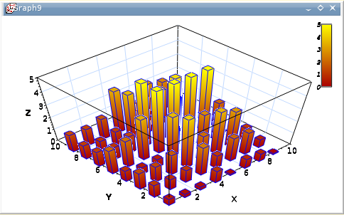
- 3D Plots→Bars
-
Makes a 3D plot of the selected data column in the active table window (only one column allowed) using the "3D Bars" style.
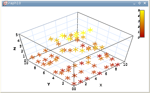
- Scatter
-
Makes a 3D plot of the selected data column in the active table window (only one column allowed) using the "3D Dots" style. The 3D point symbol style can be changed via the 3D Plots Settings dialog.
With scatter plots, you can choose the kind of graphic item which is used to plot the data points. The example above is done with cross hairs, but you can also select points or cones. This can be done either with the corresponding icons of the 3D surface toolbar (respectively

 and
and  for cross-hairs, dots and cones) or with the custom-curves dialog.
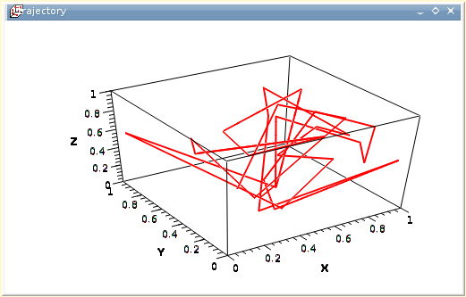
 - 3D Plots→Trajectory
-
Makes a 3D plot of the selected data column in the active table window (only one column allowed) using the "3D Line" style. The line width and color may be changed via the 3D Plots Settings dialog.